Redesign of data-rich interfaces built for avid traders
Provided extensive research based on business needs and transforming them into seamless experiences and intuitive designs, worked under a design agency for a growth-startup client
10K user sign-ups
+80% development efficiency
+15% client retention

During my role as a product designer at Wonderstruck Studio, a Web3 design agency, I worked with a high-growth startup, who was in the process of rebranding and expanding its product offering. Originally launched as a TestFlight website, the company wanted to transform the platform into a fully developed iOS app and desktop application. The trading platform that sets itself apart by allowing users not only to browse and analyze tokens but also to trade directly within the platform, something most competitors don’t offer. Their mission is to create the fastest and most accurate token discovery, charting, and trading platform, empowering users with real-time insights and seamless execution across devices.
High-Density Data in Previous Product
Client is building the platform to showcase for their API product which means that the platform has to cover all information, moreover, in current state of the product is already information overloaded. On top of that, they want to build a mobile app compacted with all the information from the platform.
My goal as a Product Designer for this project
Creating intuitive designs and branding for the product while consolidating complex hierarchy and ensuring all in product features and needs.
Navigating through research and the crypto trading platform market to hold the defined’s product in high standards in competitiveness
RESEARCH
Why is mobile-first becoming popular in trading?
51%
of users use mobile as their primary method of accessing crypto wallets
Competitive Landscape

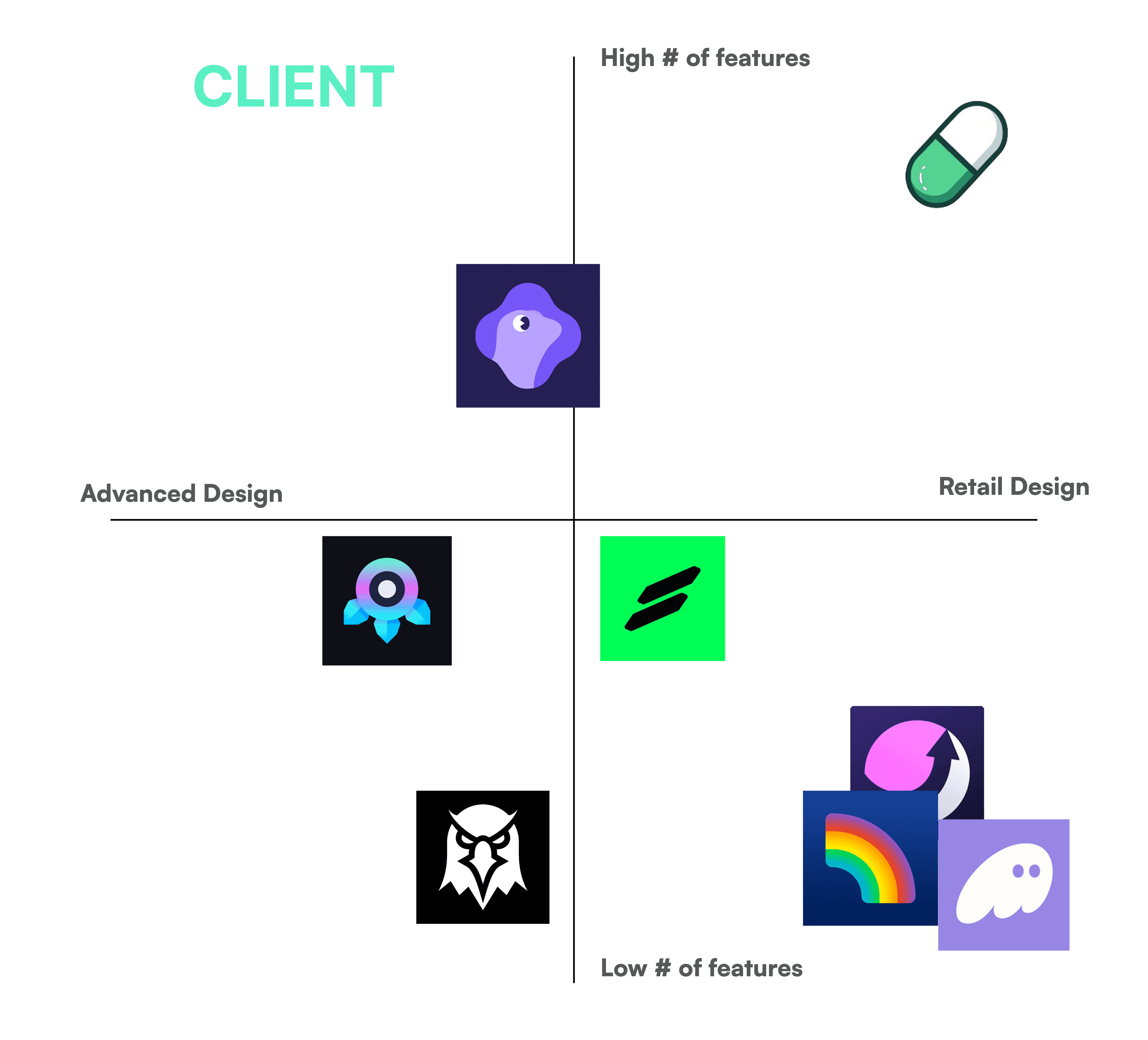
Product Analysis Matrix
The product analysis matrix allows me to understand what features the respectful products have in the market and how they are designed for their users

Product Positioning
The product analysis matrix allows me to understand what features the respectful products have in the market and how they are designed for their users
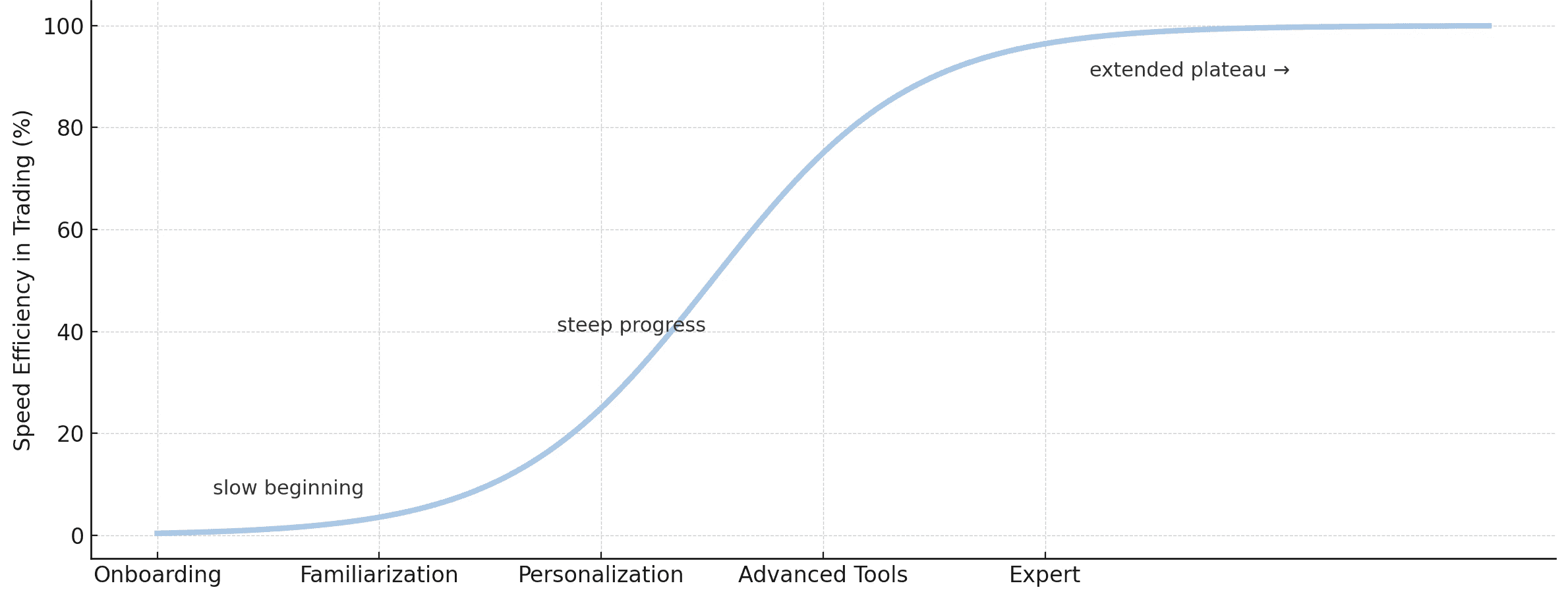
Intuitiveness Depends on Reducing Friction in Onboarding and Early Flows
Some avid traders want to stay on top of data and information, they don’t want to spend time learning tools. The more screens and required steps during onboarding, the more likely users skip customization or abandon the product.
Barrier to Entry with Familiarity
Loyal users have a lower chance of switching to other apps unless there is a product that has a differentiated tool that enhances their trading skills.
Data-Dense Products Require Stronger Information Hierarchy
Poor hierarchy → overwhelming → slower decisions → higher churn
Personalization and Customization are essential
In advanced products, some avid traders prefer THE nitty gritty customizations such as hiding unnecessary widgets, reordering data modules, or chart visualization while others don’t need them. Because of that these avid traders have a higher retention rate.
Product Design Strategy
Flat colored “masculine” UI layout with consolidation and spatial optimization that preserves real estate, to inform information hierarchy for reducing cognitive load.
Reduce onboarding friction by offering recommended setups, generating tooltips, and progressive disclosure when users use features.
Build a hybrid and accessible experience that adjust to user levels by offering “Advanced mode” / “Normal mode” toggle in settings.
Give users more power with advanced personalization and customization over their environment with features like adjustable modules, savable presets, and hide noise.
Ideate
Moodboard


Client desired an exciting, fast, and sharp look that will resonate with crypto to their app. Crypto app arguably has the most masculine looks as 80% of the crypto industry are male-dominated. Let alone, our client’s users covers male users especially. Client and our team discussed UI looks of Brutalism/Neo-brutalism, retro-futurism and acid designs with minimal and two-toned contrast designs. They also requested Dark-mode and light-mode. Because of all the factors of brutalism, retro-futurism, and acid design, we decided on the ASCII terminal look with a typography of brutalism and mono.
Dark vs Light Mode


Prototype
Core User Flows

Challenges
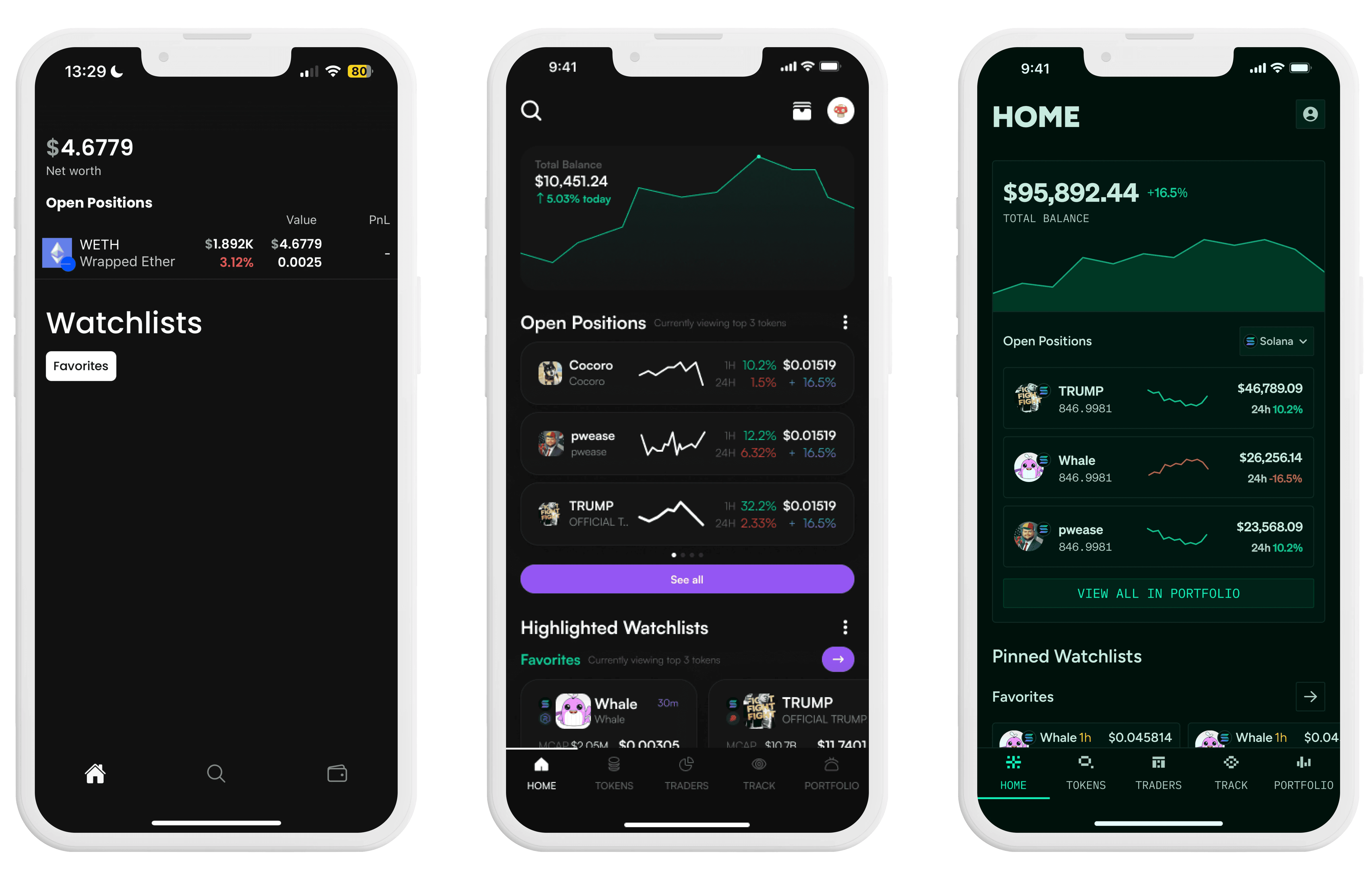
Token Page (Card Swipe vs Non-Card Swipe)
Client desired a card swipe view for the token page vs standard vertical view - this is how I explained vertical scrolling is better than card swipe view.
Vertical Scrolling
Vertical scrolling displays 8 tokens simultaneously, allowing users to scan multiple options with a single fluid gesture and spot patterns instantly through peripheral vision. One flick moves you through 15+ tokens in seconds without animation delays, and comparing tokens is effortless since they remain spatially related. This approach means browsing 50 tokens takes seconds rather than minutes, making it vastly more efficient for rapid token discovery.
Card Swipe View
Card swipe view creates a focused and comprehensive detail about individual tokens but inherently slow browsing experience for discovering crypto tokens because users are essentially browsing 50 tokens that requires 50 individual swipes. By presenting one token at a time in full-screen cards, users must perform repeated swipe gestures to progress through available options, with each swipe triggering an at least 1 second of interaction time before the next token appears. The card swipe view is essential for components that requires little cognitive yet very crucial information needed that users can scan quickly. e.g) Tasks, profile, content. However in this case, crucial data is already shown in token discovery page for 50 tokens that are fitted in one screen.
Revision and Hand-off
Revision
Creative freedom but at what cost?
A key challenge in this project was working with a client who was extremely agreeable. While this provided creative freedom, it made it difficult to validate whether the designs were truly aligned with business needs. I reframed my approach to instead of designing for approval, I designed to solve the client’s unspoken problems. I shifted the conversations from aesthetics to strategy by presenting each design with clear reasoning tied to user behavior and product goals. I guided the client toward solutions that were not only visually strong but suited to the product’s long-term direction. This helped ensure that our final decisions were intentional, evidence-based, and high-impact rather than aesthetically pleasing designs.
Verifying constraints beforehand
During this project, I faced challenges aligning the design system across the client’s engineering and design teams. There were repeated iterations caused by mismatches between what was technically compatible for iOS and what was aesthetically preferred by the client. For example, typography was changed to Figtree and the icon library was switched to Ant icons without clear communication, which created inconsistencies and rework. For future projects, I plan to communicate these standards upfront to avoid misalignment and ensure the design system reflects both the client’s preferences and engineering constraints.
Hand-off
For handoff, I delivered a fully structured design system and prototype, ensuring a smooth handoff under tight deadlines. This process helped the team ship a consistent MVP quickly while setting a foundation for scalable future updates.

Mobile Product
Figma prototype with flows
Full design tokens and system
Responsive constraints
Toast, Snackbar, and Banner UI
Components library with 50+ usable components
Written documentation for edge cases, loading states, component states, and constraints
Graphics
Dithered graphics svg and animations for onboarding, loading, icons, and thumbnails